What symmetry teaches us about interfaces
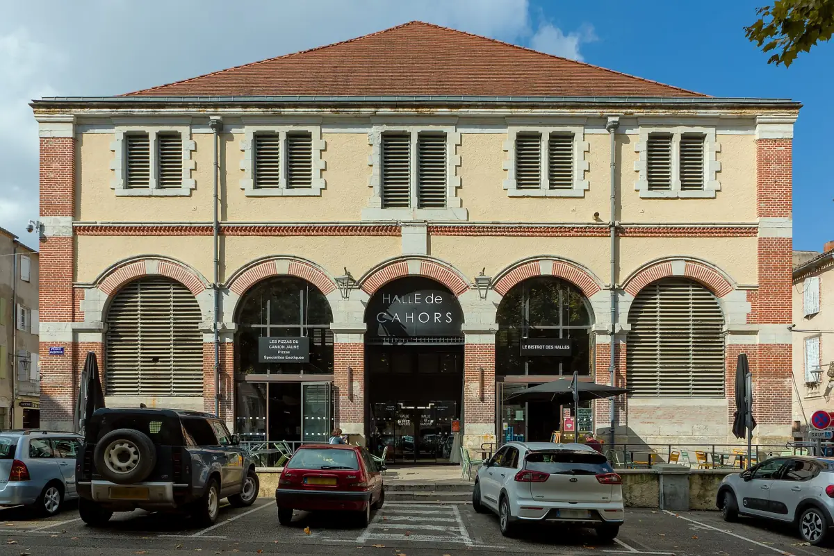
A colonnade is not symmetrical for beauty alone. It is symmetrical because repetition makes exceptions legible — the same reason interfaces need a grid.

A colonnade repeats the same element at a fixed interval. The effect people call beautiful is mostly a side effect: once the rhythm is established, any deviation becomes information. A wider bay means an entrance. A missing column means something happened here.
Repetition is a carrier for meaning
Interfaces work the same way. If every card in a grid shares one shape, a card that breaks the shape reads as important without any extra styling — no colour, no badge, no animation.
The mistake is to treat visual consistency as an aesthetic preference. It is closer to grammar: it is what makes the exception readable.
You cannot emphasise anything in a layout where everything is already different.
Practical rules
- Pick one rhythm — a spacing scale, a column count — and keep it until you have a reason to break it.
- Spend your exceptions. Two per screen is usually the budget.
- When something needs emphasis, remove decoration from its neighbours before adding decoration to it.
The colonnade also ages well, which is the second lesson: a system built from one repeated part can lose a piece and still read as whole.